Last week, I released a Photoshop script that I’ve been using to make icons and rounded rectangles for my iOS 7 app updates. The script generates shapes using values that I reverse-engineered from Apple’s UIBezierPath class. If you’re creating rounded rects for user interface elements, the shapes it produces are a near-exact match. If you’re creating icons, the match is really, really close.
Then, a couple of days ago, I received this tweet from Nick Heer:
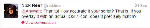
Great question, Nick! It looked great when I overlaid the generated icon in Photoshop a while back, and that’s essentially how I replied to his tweet. But Nick’s question got me thinking…how great is it?
An easy way to test two images to see how well they match is to stack them as layers in Photoshop and set the top layer’s blending mode to Difference. As the name implies, Photoshop blends the two layers by computing the difference between each and every pixel in both images. If the images are an exact match, each pixel’s difference is zero, and you’ll see a solid black result.
I started by taking a screenshot of my third-generation iPad running iOS 7 with a solid black background and zoomed-in 400% to the upper-right-hand corner of the Calendar icon (chosen because its solid white background makes for easy comparisons):

I used version 1.1 of my script to create a 152 pixel x 152 pixel solid white iPad Retina icon. Next, I merged the icon with a solid black layer to avoid any problems differencing a layer with transparent pixels. Finally, I aligned the generated image, set its blending mode to Difference, and saw this (note that I’ve slighty bumped-up the gamma in these images to make it easier to see the edge differences):

Pretty good! But not what I’d call exact.
I needed to double-check my testing method, so I extracted Apple’s AppIconMask~ipad@2x.png file (which is a black image mask with an alpha channel). I used that image to mask a solid white layer, and I set its blending mode to Difference:

The result is as perfect as you can get. The edge pixels are all a pure zero-valued black, meaning that there is no differece at all between the AppIconMask file and the actual icon.
Okay…now I know that my testing method is sound. I’ve learned that the UIBezierPath-generated shape that version 1.1 of my script produces is close, and I’ve learned that Apple’s AppIconMask provides an exact match.
How can I modify the shape so that it more closely matches the AppIconMask reference?
Survival of the Fittest
While I wouldn’t consdier myself an expert at optimization problems, I’ve written my fair share of optimization code in the past (most notably, a conference scheduling algorithm from my time at Microsoft, when I was on the evangelism team that ran our huge technical events…like WWDC). This problem looked like a nail I’d seen before, so of course, I picked up my genetic algorithm hammer and got to work.
As Wikipedia states: “a genetic algorithm (GA) is a search heuristic that mimics the process of natural selection.” It’s a great way to find possible solutions to a problem that would be too difficult to solve using brute force methods. Basically, you write code that generates a population of possible solutions to your problem. Those solutions are evaluated based on a fitness function. The “fittest” solutions go through the process of crossover and mutation (see the Wikipedia article for more details), and the process begins again with a new generation. If you’re really interested, I tried to provide a layperson’s overview of the process in this video from 2008.
My fitness function is simple: like the Photoshop Difference blending mode, I wrote a function that calculates the numeric difference between two images. The reference image is the AppIconMask image, and the comparison image is the result of generating an icon using my custom JBBezierPath class (which normally matches UIBezierPath output to 4 or 5 decimal places).
First thing’s first. Now that I have a way to objectively evaluate the accuracy of version 1.1 of my Photoshop script, I ran its output through my fitness function and discovered that it had a difference of 4,606. That means that the difference between the alpha values of the AppIconMask image and my generated image has an accumulated total of 4,606. If one pixel had an alpha value of 186 and the same pixel in the other image had a value of 154, that would contribute a difference of 32 to that total. You can actually see those differences in the earlier Photoshop image.
So, I wrote my GA app and before I went to bed, I pressed its Go button. The app isn’t anything to look at, but if you’re curious, here it is:
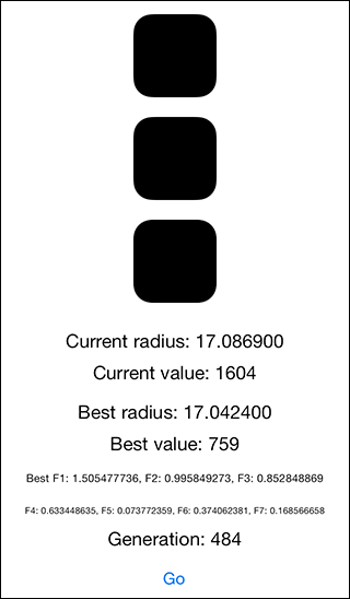
The top image is Apple’s AppIconMask (the reference). The second image is the current generated icon, and the third image is a difference image (like Photoshop). Otherwise, the values show some current values, some best values, and some other factors.
In the morning, I collected the best solution and fired off a few more hand-tweaked GA runs after I noticed some interesting patterns:
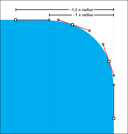
In the data, it appeared that one of the factors really, really wanted to be equal to 1.0 (it was darn close) and another had similar affection for 1.5. These factors directly relate to the corner radius of the icon, and it makes intuitive sense that the curve should end at—or very near—the corner radius point. I didn’t want to force the data to fit my expectations, but since this is an optimization problem, I ran a few more generations that were closer to those ideal values. I ended up with values that are near to ideal (but not equal), because they produce a better fit.
I also noticed that the corner radius value for a 152 x 152 icon wanted to be 34, and in fact, that’s where I left it. Note that this bolsters Manfred Schwind’s 27 pixel corner radius argument for the 120 x 120 icon.
In the end, the solution I chose has a calculated difference of 759…much lower than UIBezierPath’s 4,606. Here’s the difference in Photoshop (with the same boosted gamma):

My GA didn’t introduce or remove any points from the UIBezierPath shape that the script was originally based on, so it’s possible that a future search could produce an even more accurate result. In retrospect, I wonder if other optimization techniques (like simulated annealing) are a better fit for this kind of problem.
As an extra step, I wondered if a squircle could provide a more accurate match, so I modifed the app to generate icons with varied squircle exponents, and none of those solutions were as close. It’s my sense that—while the original icon shape may have been inspired by a squircle—it appears that it’s either based on a different algorithm or has been hand-tuned post-generation.
I’ve updated my Photoshop iOS Rounded Rect script to version 1.2, and if you choose the Improved icon shape checkbox, you’ll get this new, optimized shape. Left unchecked, the corners will be created based on the UIBezierPath values (which are still appropriate for non-icon user interface uses).
This exploration has been fun, and I thank Nick Heer for inadvertently prompting it!
Leave a Reply