In early December, 2011, I was both surprised and flattered to discover that Apple had named Halftone as one of the best photo apps in its App Store Rewind 2011. Since then, I’ve received a lot of e-mail asking me how I did it. That is, what did I do to “get” Apple to pick Halftone? I don’t know what kind of response they expect, but I’m sure that I disappoint them when I respond:
I have no idea.
I’ve certainly thought a lot about the question, but I have no special insight into the process or criteria that Apple uses to assemble its year-end list. That said, I’d guess that one criterion is quality and another is likely user experience. I invest a lot of time trying to craft an experience that delights and empowers users.
The stamp feature of Halftone serves as a good example.
There are many apps that allow users to add graphic elements to a photo or a document, and in almost every case, the graphic element is a bitmap. There’s nothing inherently wrong with bitmaps, of course, but for Halftone, I wanted to enable users to freely move, rotate, and scale stamps with no loss of quality. That meant that the stamp feature needed to use vector-based elements.
Unfortunately, the iOS SDK has no native support for vector graphics formats (like SVG, EPS, and AI), so I had to develop my own solution.
If you’ve followed me for a while, you’ll know that I’ve written a couple of free plug-ins for Adobe Illustrator. The most recent, Ai->Canvas, adds a new option to the File/Export menu in Illustrator that makes it easy to use vector shapes and basic animation with HTML5 canvas elements (watch this short introductory video if you’re curious).
Remembering that the canvas element was created by Apple for WebKit, and recognizing similar concepts in Quartz 2D, I decided to build a new plug-in that exports Illustrator artwork directly to Objective-C code. I’ve used the plug-in to create the code that draws all of the stamp shapes in Halftone.
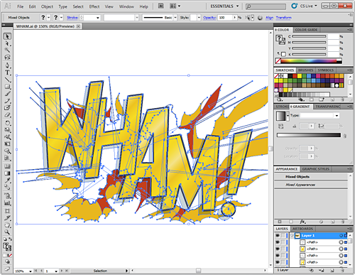
For example, this WHAM! artwork in Adobe Illustrator:
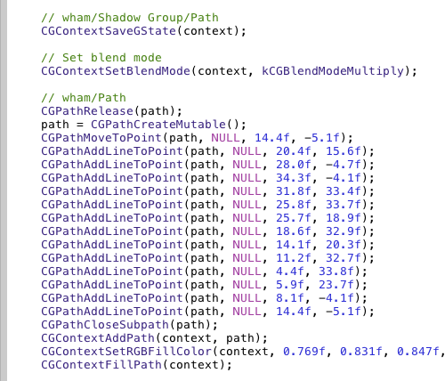
Exports to this Objective-C code that I paste into my Halftone Xcode project:
By drawing native vector shapes, Halftone can render its stamps at any resolution with very high quality. That’s why you can turn on the Full Size setting in Halftone and create stamps that look fantastic, even close-up:
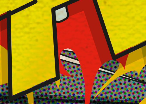
I’m confident that most users don’t know (or care) that the stamp feature is based on vectors, but I do. Also, most users don’t zoom-in to full size Halftone images to examine the pixels, but for those who do, they’re going to see the finest output that I know how to create. Whether or not it’s consciously noticed, this attention to the smallest detail certainly contributes to an overall feeling of quality.
I doubt that Apple knows anything about the effort that went into the stamp feature in Halftone, but I like to think that they did recognize its contribution to the overall quality of the app.
A second example—also related to the stamp feature—is that I try to re-think interaction methods when designing for a touchscreen interface. One of the best things about a touchscreen device is that it feels like you’re interacting directly with objects that are just underneath your fingertips. That means that many of the common interactions that were developed for indirect input (like a mouse) should be reconsidered.
In almost every graphics application, you know that you can click on an element to enter an editing mode and use “handles” to scale and rotate the element. These are such common interactions that you might not even think about it. Step back for a moment, though, and you’ll realize that these handles were created for your mouse, and over the years, you’ve been trained to adapt to the computer more than the computer has adapted to you.
To discover a more natural interaction, I placed a sheet of paper on the desk and began to manipulate it with my fingertips…just like you would with a touchscreen device. The great thing about tests like this is how surprisingly obvious the interaction becomes. You’re interacting directly with a physical object, and you just “know” what to do. If there’s a way to duplicate this interaction with touch, it’s likely to seem just as natural to your users.
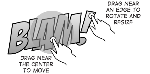
So, to move a stamp in Halftone, you touch somewhere near the center of the stamp and drag it wherever you’d like. No editing mode. No interacting with artificial interface elements like handles. No visual indicators. Just direct interaction with the stamp itself.
To rotate, you touch near an edge and start spinning the stamp around. Scaling works the same way…just touch and drag an edge away from the center. Even though you can’t scale a physical sheet of paper, it’s easy to imagine what you’d want to do. After you’ve tried these interactions just once, you quickly forget that they’re anything special, because they behave “as expected.” Plus, there are no special editing modes that the user has to learn, track, or maintain.
Out of curiosity, I built a test version that rotated and scaled around a second touch point. This method worked well, but it required two hands and added unnecessary complexity, so I removed it.
Like the vector functionality, I have no idea if Apple noticed or considered these interaction methods in their deliberations, but I can tell you that with over one million users and all of the e-mail I receive, nobody has mentioned any difficulty with these methods. To the contrary, I very frequently hear how easy it is to use Halftone.
I’m proud of the stamps in Halftone. Most people don’t know how much effort it took to make the feature work (nor do they need to know). I do believe, however, that the effort contributed to a more natural and delightful interaction with the app, and I trust that the high output quality is noticed, even if everyone isn’t a pixel peeper.
It would have taken considerably less time to build a feature with standard bitmap images that could be rotated and scaled with typical bounding box handles. But I wanted to push what’s possible with touchscreen devices and to explore new interaction methods.
Often, it’s difficult to know exactly what an app or a feature should or shouldn’t do. It’s difficult because—as developers—we have the burden of professional knowledge: we know how much work it will take.
My advice is to train yourself to recognize and note the small (but important) reactions that you have when you’re working with your own apps. Dismiss your professional knowledge about the effort it will take and consider the experience alone. Only when you’re willing and able to do what’s necessary to perfect a feature will you be accomplishing your best work. Your exit criteria should be when you’re delighted to use your own app or feature and surprised that you were able to pull it off.
At the end of the day, I don’t know exactly why Apple picked Halftone, and I’ll probably never know. But, I like to think that it had something to do with providing users the best experience I knew how to provide.
Leave a Reply